
When Stats Lie

Just like many wise things that Plato said and we acknowledge, one which stands out in the world of data is, "A good decision is based on knowledge and not on numbers."
While “Numbers Don't Lie” is a truth, how we see numbers may tell a different story. To the extent of cognitive bias, some may rely heavily upon to see data through the lens of stats, thinking statistics give the ultimate crux of numbers. The phrase is, to a hammer, everything is a nail.
So, in this blog post, we'll learn with an example the ultimate case, WHEN STATS LIE!!
Anscombe's Quartet
To counter the impression among statisticians that "numerical calculations are exact, but graphs are rough,” Francis Anscombe came up with a Quartet.
Anscombe’s Quartet comprises 4 data sets with nearly identical simple descriptive statistics like the number of data points, mean, variance, etc., yet have different distributions and appear very different when graphed.
The datasets had peculiarities that could fool a Linear Regression model.

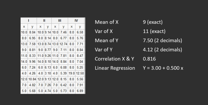
Dataset 1
The scatter plot for the first dataset has a normal distribution and, it appears to hold a simple linear relationship.
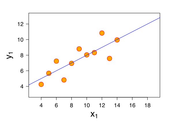
Dataset 2
The data points of the second dataset do not show a normal distribution. Had we not visualized this data, we would have never known that the distribution is not normal, and there is no point in fitting a linear model to data having a non-linear relationship.
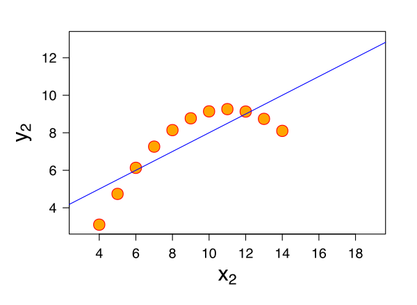
Dataset 3
In the third dataset, the distribution is linear but should have a different regression line. The one outlier in this dataset exerts enough influence to lower the correlation coefficient from 1 to 0.816.
Think of it as, for a health survey of 11 people, one very tall person projects a false impression that the group’s average height is high.
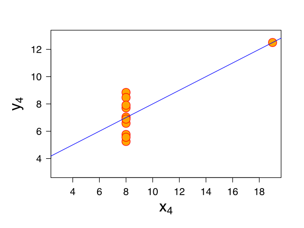
Dataset 4
The scatter plot for the fourth dataset shows an example when one high-leverage point is enough to produce a high correlation coefficient, even though the other data points do not indicate any relationship between the variables. In simple words, it is like comparing apples with oranges.
Hence, Anscombe’s quartets prove that statistics alone don't tell the whole story sometimes and how, when visualized, data can tell a vastly different story. Apart from unmasking the spurious statistical knowledge, data visualization serves various purposes.
Why Visualize Data
Five ways data-visualization help derive knowledge are:
- Track changes over time: This is perhaps the most basic yet valuable data visualization use. Most data has an element of time involved. Therefore, the first step in data analysis is to see how the data trends over time.
- Determine frequency and distribution: One simple and powerful use of data visualization is to check how frequently an event occurs over time.
- Finding clusters: Visualizing the data helps identify groups or clusters sharing commonalities which can be further segmented and targeted strategically by marketers.
- Scheduling: A Gantt chart helps plan a complex project by clearly illustrating each task and how long it will take to complete.
- Risk Analysis: Using color-coding, control limits, KPI indicators, etc., in the form of data visualization elements can explain complex functions which go behind in determining the risk for metrics in a mere glance.
There are more uses of effective data visualization than we just discussed. The fact remains that we internalize what we can see. Therefore, data visualization is the key to communicating insights from the data.
If you want to learn more or continue this journey, head over to https://ftdacademy.com/yt to see our entire catalog and sign up for a seven-day free trial. So you can start learning today to elevate your career tomorrow.